What is ?
Etsy
Etsy is a global marketplace for unique and creative goods, focusing on vintage items and craft supplies.
This case study is an example of putting user needs, and limitations at the center of the design thinking process, ultimately leading to a more seamless and enjoyable user expereince.
The mission of this concept project was to redesign the Explore section of the application,
which has some ambiguous segments for potential users.
Project Overview

Team

Role

Tools

Duration
3 Months - Part Time
Group of 4
UX Designer
Figma, Figjam, Zoom
Intensifying accessibility of the "Back Button" by adding a background to the icon.
Eliminating the small square shape and replacing it with the "View Product" hyperlink to clarify.
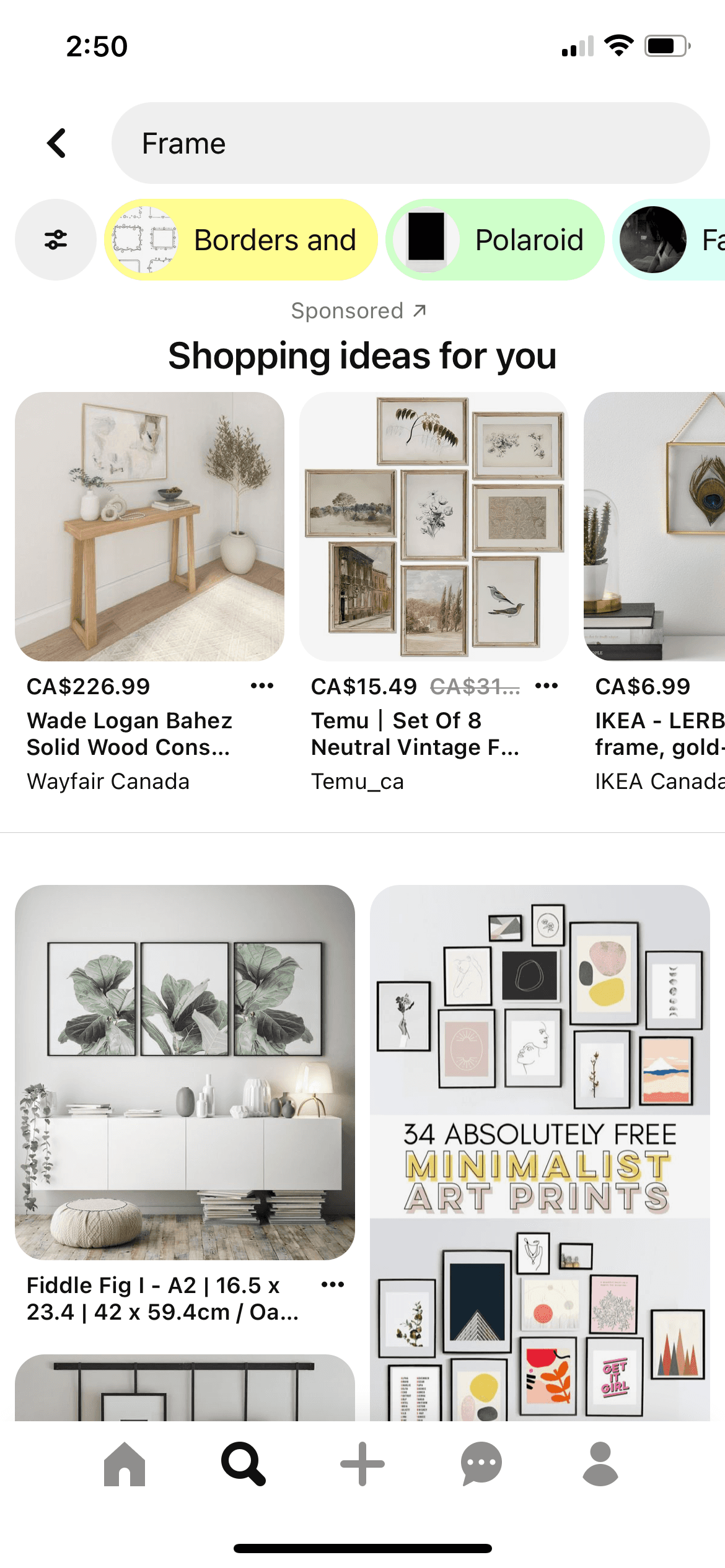
Re-titling "Discover" into "Popular on Etsy" for more comprehension.
Improving the purpose of "For You" and "Discover" by taking them from two tabs into one.
Adding a search bar and suggested keywords, hence users can easily browse the Explore section.
Solution
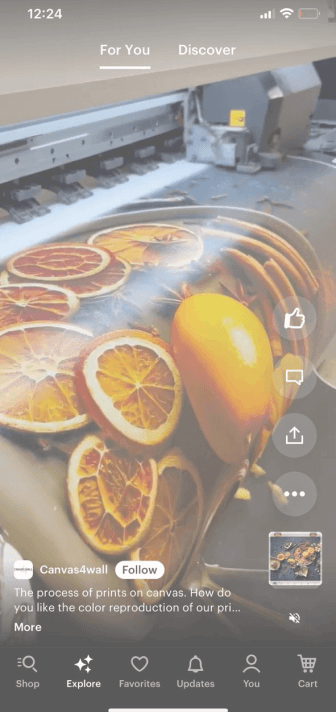
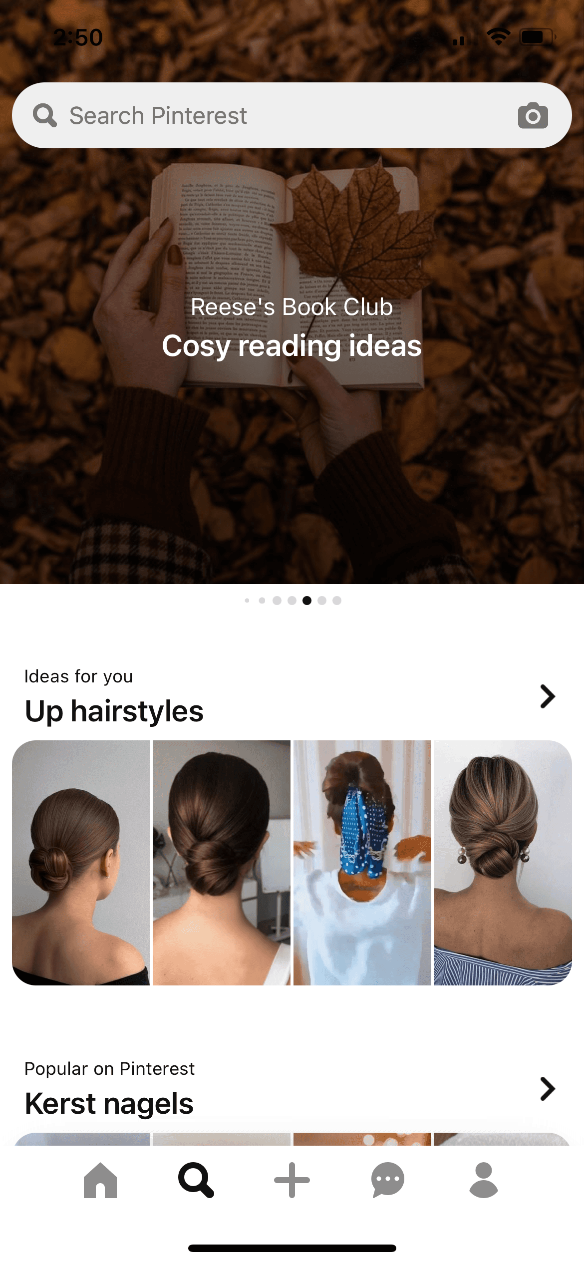
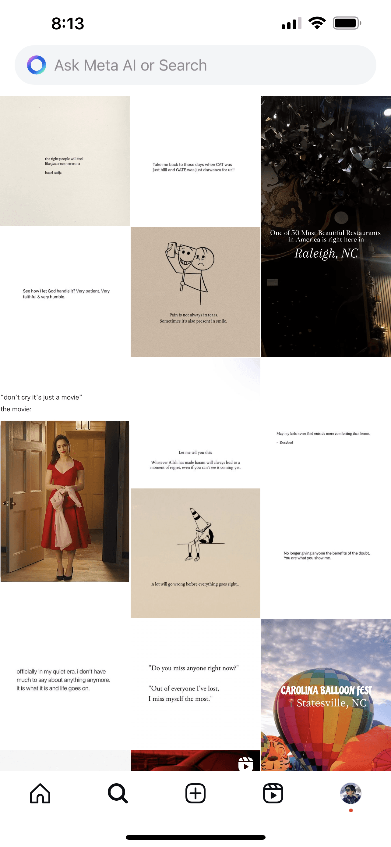
Overwhelming layout of the videos on the "For You" tab bar, forcing users into excessive scrolling.
Problem Statement
The absence of a search box on the Explore page leads the users to confusion.
Undistinguished "For You" and "Discover" tab bars, consequently users could not explore successfully.
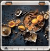
The baffling concept behind the small square on the product page, the intent was unclear to users.
Unnoticeable "Back Button" on the product page.
The Process
DELIVER
DEVELOP
DEFINE
DISCOVER
Our teams of four utilized the Doble Diamond method, grounded in Design Thinking Principles.
The process wasn't strictly linear; we navigated back and forth between stages as the project evolved.
Discover
We conducted our research in three phases.
Competitive Analysis
Heuristic Evaluation
Synthesis and Analysis of the current application
Heuristic Evaluation
Before conducting user interviews, we performed a heuristic evaluation of the explore section to identify
the section's problem. Hence, we gained a deeper understanding of what we should focus on more during our
user research phase.
Synthesis and Analysis of the current application
Task:
Users were asked to browse for random gift ideas in the Explore section.
At first, we assigned one task to 15 users and gathered feedback.
While synthesizing our findings, we recognized some common
pain points users experienced while using the current application.
A significant number of users struggled with the confusing layout of the "For You" section, finding it difficult to navigate.
80% of participants did not notice the difference between the "For You" and "Discover" tab bar on top of the Explore Section. (12 out of 15 users)


A: 60% of users found it difficult to locate a clear way to go back or exit the "For You" section. (9 out of 15 users)
B: 73% of users prefer to see a Search bar on top of the Explore section. (11 out of 15 users)
C: 93% of users did not grasp the concept behind the small square. (14 out of 15 users)

A and B
C
47% of users would like to see top sellers, deals, and seasonal items on top of the Explore Section. (7 out of 15)
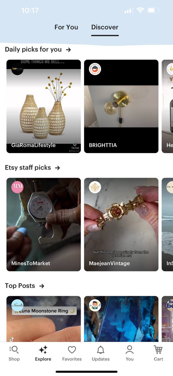

Competitive Analysis
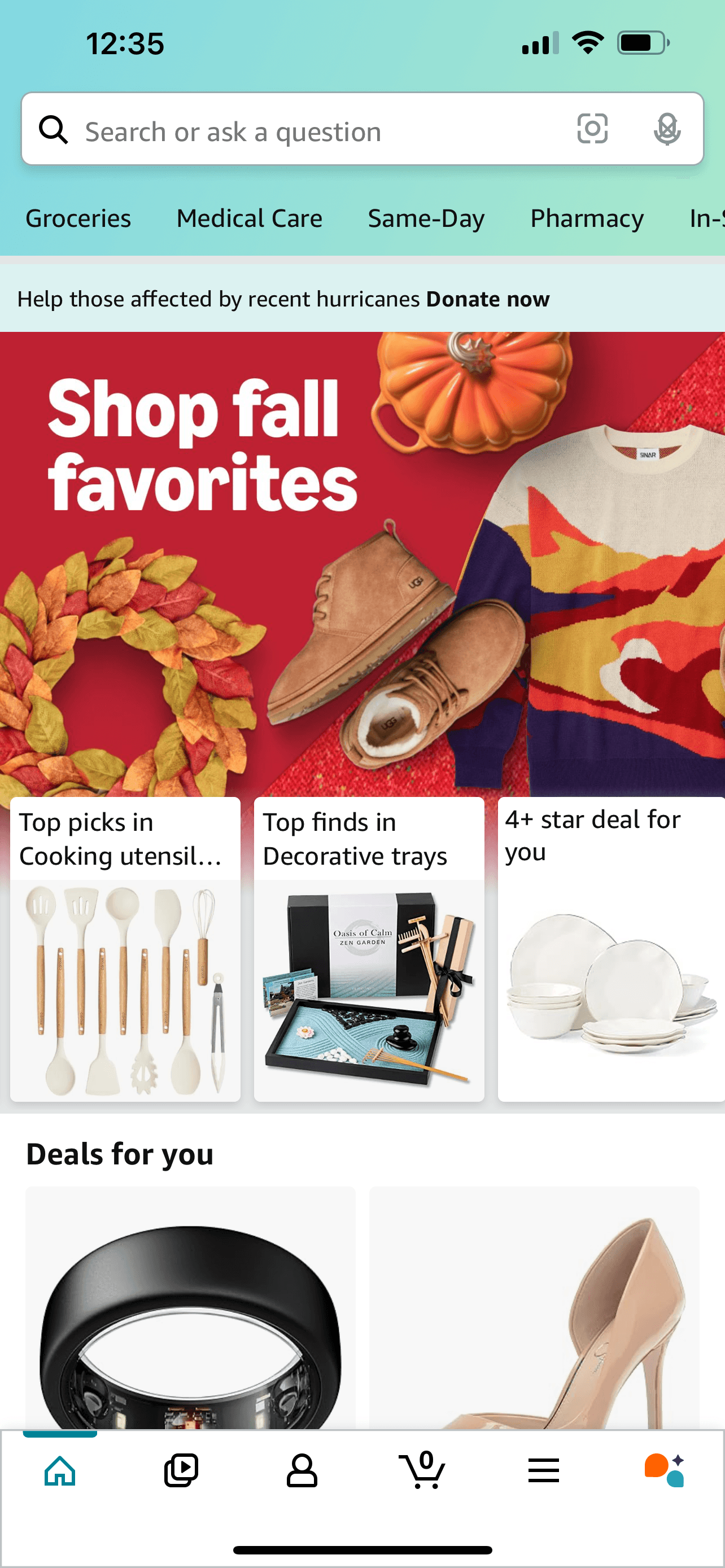
We conducted a competitive analysis to compare Etsy's explore section with selected apps such as Amazon, Instagram
and Pinterest. This analysis provided us with a better understanding of our competitor's perspectives and helped us improve our application to better meet the needs of our target users.

It is easy to scan item descriptions and details.


Important categories are easy to find.

There is a search bar at the top of each page.


After narrowing down the filtering;
users can even more do filtering such as choosing price range or different sellers.


Highlighted categories can be found easily by scrolling down to the page such as the Ideas for you, Popular on Pinterest, etc.
There is a search bar on top of the Explore section.

There is a search bar on top of the Explore section.
The “Shop link” which is accessible during live videos, leads to an overview of the product details; makes it easier for the user to shop.
Looking through all of the videos is easy because of the layout of the videos on the page.
Define
Shaping Solutions with 'How Might We' Questions
During the user research phase, we discovered pain points in the Explore section that affect usability and the overall browsing experience. These insights led us to create 'How Might We' questions to define potential design solutions.
“How Might We” clarify
the 'For You' and 'Discover' tabs for better navigation?

Merging the “Discover” and “For You” tabs together.


“How Might We” highlight top sellers and seasonal deals in Explore to increase engagement and visibility?

Adding keyword suggestions below the search bar.

Introducing a search bar.

“How Might We” simplify the 'For You' section for intuitive navigation?

“How Might We” design
the Explore page to improve browsing and accessibility?
Redesigning the layout of the Explore section.

User Flow
This visual represents our user journey from the first interaction to the final outcome, allowing us to spot and address obstacles to improve product flow.